How to Make Night Reading on Your Phone More Comfortable
Night reading does not need a dramatic 'perfect' mode. What usually matters is reducing the difference between the bright screen and the dim room, keeping the text easy to follow, and removing interruptions. The right combination is personal: some readers prefer warm paper tones, others prefer dark text on a muted background, and some find true black less comfortable than soft gray.
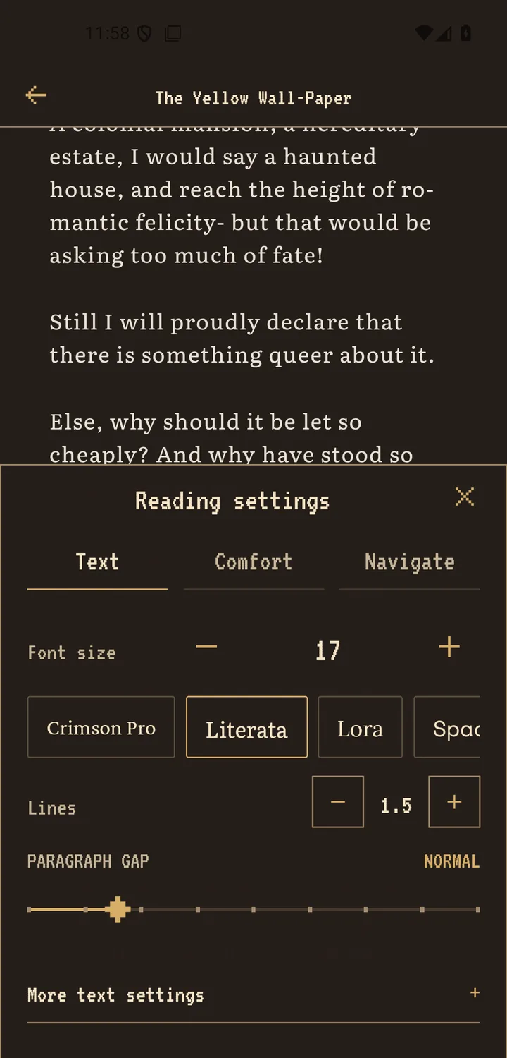
Scroll+ provides optional warm, parchment, dark, and E-Ink-style appearances alongside typography controls. These are display preferences, not medical treatment and not a guarantee against eye strain or sleep effects. For the full order of typography controls, begin with the Android reading-settings guide.
1. Set room and screen brightness before choosing a theme
Start with the phone's device brightness. Lower it until the page no longer dominates the room, but keep enough contrast to read punctuation and fine letter shapes. Avoid making the display so dim that you compensate by holding it closer or squinting.
A page theme cannot correct an unsuitable device brightness by itself. Make one small adjustment, read a paragraph, and let your eyes settle before adjusting again. Android also offers system display and extra-dim options on supported devices; availability depends on your phone and Android version.
2. Choose the page appearance by comfort, not by label
Try Scroll+'s dark, warm, parchment, or E-Ink-style appearance with the same paragraph. Check whether the body text stays distinct and whether headings remain easy to locate. A dark theme is an option, not a rule; a muted light page may suit you better.
Keep the promise modest: color filters change how the page looks, but they are not eye protection or treatment. If you want to understand which books give you the most control over type and page color, see EPUB versus PDF for phone reading.
3. Make the text easy to follow from a normal distance
Increase text size if you keep moving the phone closer. Add a little line spacing if you lose your place between lines, and use moderate side margins so lines are neither extremely long nor broken every few words. Reflowable EPUB and extracted PDF text offer more control than fixed original pages.
Change your position as well as the screen. Support the phone so your hand is relaxed, keep a comfortable viewing distance, and avoid reading in a posture you cannot sustain. If a fixed PDF forces repeated zooming, compare reflow and native PDF view before blaming the theme.
4. Create a quiet session boundary
Use Android's notification or Do Not Disturb controls if messages keep pulling you away. Decide on a small stopping point, such as one chapter, one section, or a few pages, before you begin. The aim is a calm reading window, not a score you must defend.
Your imported books remain available offline in Scroll+, so reading itself does not need a connection. Account and Nova features may synchronize when a connection returns. If fewer online dependencies help you settle into a book, read the private offline reader guide.
Comfort is feedback, not a badge
A useful night setup is one you can read without fighting the screen. Balance room and device brightness, choose a clear theme, enlarge and space the text as needed, and remove interruptions. There is no prize for pushing through discomfort; pause and revisit the setup if it does not feel right.
Android controls mentioned in this guide
- Android Accessibility Help: System guidance for font size, display size, dark theme, color correction, and extra dim settings on supported Android devices.
- Android Accessibility Help: Reading mode includes adjustable theme, font, bold text, and line spacing for supported content, but not PDFs.