Best Reading Settings for an Android Phone: A Practical Starting Point
There is no single best font size, line spacing, or color theme for every reader. A setting that feels clear on a quiet sofa may feel cramped on a moving bus. Screen size, room light, the book's format, and your own preference all change the answer.
The useful approach is to start with a neutral setup, change one control at a time, and judge it on a full page rather than a menu preview. Scroll+ lets you adjust font size, text color, line and paragraph spacing, text width, light or dark themes, and optional comfort presets for reflowable reading. If a PDF remains fixed to its original pages, first read about reflow versus native PDF view.
1. Start with font and text size
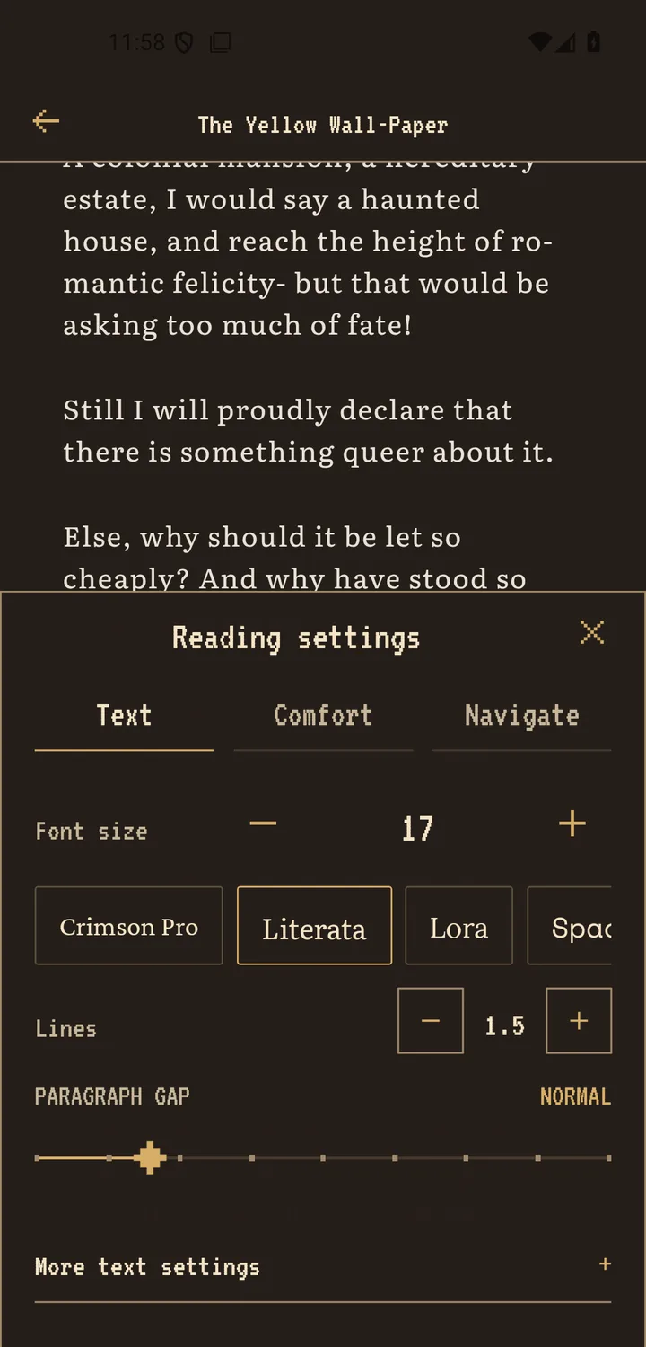
Use a reading font whose letter shapes remain distinct at your normal viewing distance. Scroll+ includes literary serif options such as Literata, Lora, and Crimson Pro. Pick one, then increase the text size until you can read without narrowing your eyes or bringing the phone closer.
Do not chase a number copied from somebody else's phone. Display density and usable screen width differ between devices. If words feel oversized and every sentence breaks into many short lines, step back once. If you keep losing small punctuation or rereading words, step up once.
2. Adjust line and paragraph spacing next
Begin near the middle of the line-spacing control. Increase it if your eyes jump to the wrong line; reduce it if each paragraph feels disconnected. Paragraph spacing should show where an idea ends without turning every page into scattered fragments.
Change one spacing control, read a full page, and only then judge it. A busy settings panel encourages endless tweaking; a real paragraph reveals whether the setting helps. For reflowable text, the related EPUB versus PDF guide explains why some files respond more predictably than others.
3. Match text width and theme to the situation
A narrower text column can make line changes easier to follow, but too narrow creates constant wrapping. Start with moderate side margins. In a bright room, a light or parchment-like page may feel natural; in a dim room, a dark or warm appearance may feel calmer. Neither theme is automatically best.
Set screen brightness separately from page color. A dark page at maximum device brightness can still feel harsh, while a light page at an appropriate brightness may be comfortable. For a low-light routine without medical claims, use the comfortable night-reading checklist.
4. Keep one baseline and make small situational changes
Once two or three pages feel easy to follow, stop adjusting. Keep that as your everyday baseline. On a bus you may want slightly larger text; for a reference document you may want a wider column; at night you may only need lower brightness and a different theme.
If the layout looks wrong only in one book, the file may be the cause rather than your global settings. Check whether it is a fixed-layout or scanned PDF before rebuilding your whole setup. The Scroll+ 0.9.0 PDF note explains how difficult files can fall back to the original page view.
The best setting is the one you stop noticing
A good reading layout disappears behind the book. Start with font and size, then spacing, width, and theme. Change one variable at a time and test it on real pages. When you can follow the text without thinking about the interface, save that setup and return to reading.
Useful Android display references
- Android Accessibility Help: Android Reading mode exposes font, size, theme, and line-spacing controls; it does not support PDF files.
- Android Accessibility Help: Android system text and display sizes can be previewed and reset from accessibility settings.